A few weeks ago I got a message from someone in distress. Allison, the founder and manager of the Satin Dollz whom we have worked and performed with, in LA for 10 years and more recently in Paris and London was in a pickle. The Paris group were about to do a showcase and the promo flyer that was presented to Allison was this...  As you can see, it is less than satisfactory for a number of reasons: The colour schemes, the random fonts, the placement and size of the text, the bad (blocky) extraction of the images (where the photos have been cut out of other backgrounds), the placement of the main subjects, the odd fade out, etc etc etc. With only a few days before the showcase and having to get them printed, she had a problem.
So, I was in the middle of a US tour and we had a pretty busy schedule. I didn't have a lot of time and had to think up something simple yet effective that would communicate who and what they are. I don't really do graphic design jobs for anyone else anyway as we are so busy but I like to help out friends when and where I can so I stayed up late for a couple of nights and threw together a flyer for her.
Ultimately, apart from showcasing the talents and image of the Satin Dollz, I wanted to create some classy because apart from being great singers, dancers and tappers (and all being stunning) they are a class act. The current flyer did NOT communicate this in any way and almost went out of its way to say the opposite.
Here is the flyer I came up with for the Paris Dollz:
 She was very happy with it and they printed and used it the next week at their showcase.
The only thing that changed from the above was that I replaced the custom logo for their standard one to keep in with their other branding:
 Then I got the next call... "Ooh, wouldn't it be nice to have matching ones for the London and LA Dollz too!". Yes. Yes, it would...
Since it was a simple design and I find that half the battle is coming up with the idea and the placement of things. Sometimes I have spent a couple of hours on a flyer, had a crash and lost all my work but it has then only taken 20 minutes or so to recreate what I had done as all the "think" work and trial and error was not wasted. Anyway, that's an aside. Here are the other two flyers:
Los Angeles
 London
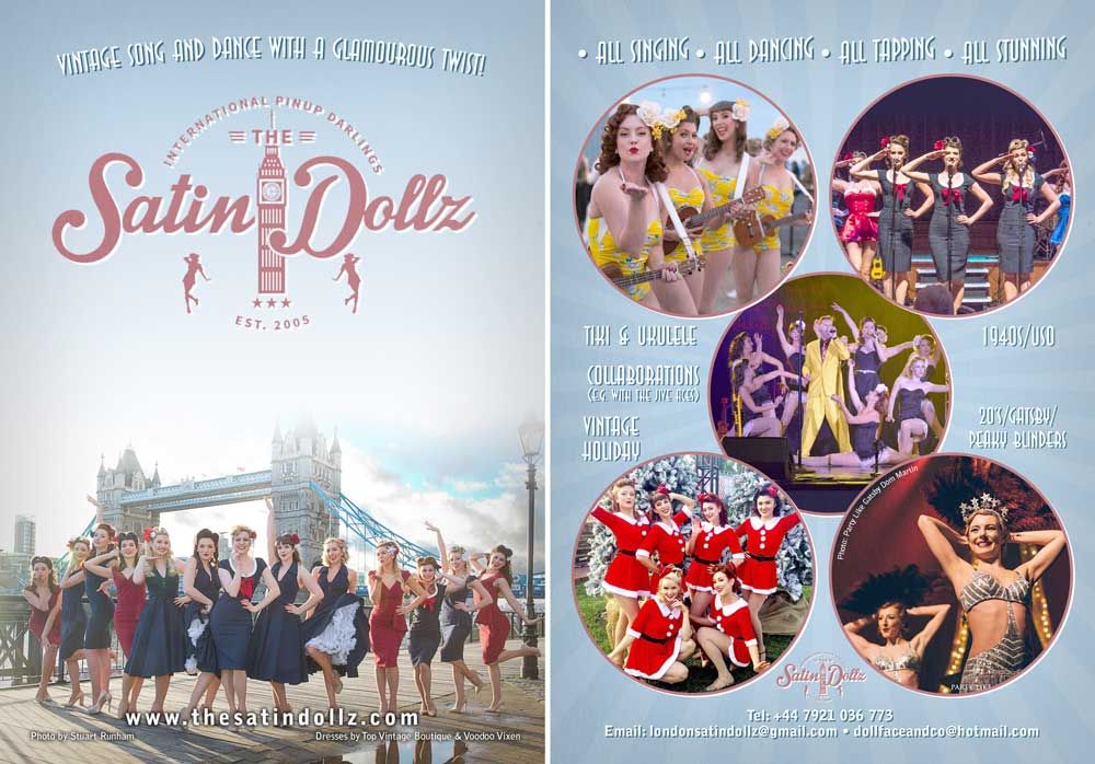
Yes, I even snuck in a cheeky plug for The Jive Aces on those ones too (Shut up, it's my job! ???).
I like the versions with their logo but for this design, I prefer my logo as it is very clean lines and adds to the simplicity but overall it was better to go with their own logo for general branding purposes to integrate with their other promo.
The main lesson from this is that if you are short of time, you don't have to settle for something crap. Just keep it simple and add only things that integrate to your message, style and design aesthetic and get rid of the stuff that doesn't.
Hope this helps. Leave me any questions in the comments below.
Cheers, Alex